

Analyzing JS Bundle Size with Webpack Visualizers
We should all be looking out for our users when it comes to JavaScript bundle size, as page load speed is a critical component of good UX. A bundle visualizer can be a very handy tool for tracking down packages, or even your own code, for large file size offenders. I’m going to talk about two visualizers, and a little journey I went on today to explore exactly when Webpack adds a package to the bundle.
I’m using a repo for starting new projects that I created a while back as the codebase for this experiment. Not necessary to look at, but in case you want a reference point for your own testing. I’m using the react branch because we’ll be analyzing a React bundle.
Webpack Visualizer
This is a browser app that lets you drop in a json file of your webpack build and turns it into an interactive chart. Here’s what my starting bundle looks like through the tool.
To get started, you’ll need to run a webpack command in your terminal of choice.
webpack --json > stats.jsonWhich I’ve made into a script in my package.json file so I can re-run it a bunch and not install webpack globally.
// package.json
"scripts": {
  // other scripts ...
  "stats": "webpack --json > stats.json"}
Note: Webpack’s docs have a section on json output.
Then you just go to the Webpack Visualizer website, drop your file in the handy labeled box, and your visualization is ready.
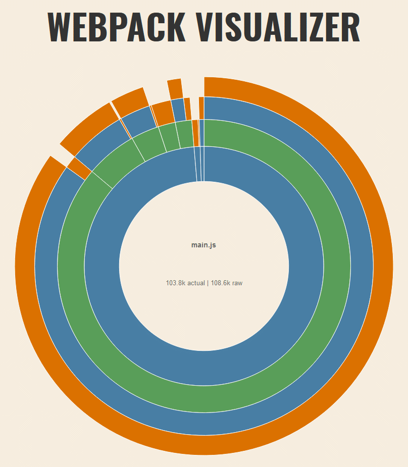
The default name and size shown in the center circle is your whole bundle if you have a single output file; in my case that’s main.js. You can see that main.js is 103.8k in actual size (non-gzipped). I wondered what exactly the rest of these colored circles represented when I first encountered it so I’ll give a quick description before moving on.
Webpack Visualizer Breakdown
You can see that when I hover the innermost blue band, “nodemodules” shows up in the center, and a thin sliver in the north becomes a lower opacity. This is to represent that `nodemodulesis part of themain.js` file, and includes all the non transparent bands within it. This is the same gif as the previous one, just placed here for easier reference while I discuss it.
As I move out to the next band, a green one with the title “react-dom”, the “nodemodules” band and a few slices in the northwest become transparent. This tells us that “react-dom” is a very large dependency in our bundle. So far we’ve determined that `nodemodulesis the vast majority of our bundle (98.7%), and that thereact-dompackage is the vast majority of size in ournode_modules`.
When I highlight a green slice in the northwest, it shows “react”. We can see from this, if we didn’t already know, that the react package is quite small in comparison to the react-dom package that accompanies it for web. Everything else becomes transparent when hovering over it to show that it’s isolated from everything at the same depth and outward.
Summed up, whatever you are hovering keeps everything that is a descendant of itself colored in full, and makes transparent anything that it descends from, or anything that is separate from it.
Finally, you can see the “src” chunk in the northern area is quite small (0.8%), and that’s my actual code (in the src directory of my project). This is a minimal example of Webpack and React so that is what we’d expect. Pretty nice tool, eh?
An Alternative to Webpack Visualizer
A nice alternative tool is the package webpack-bundle-analyzer package. The UI can be a little wonky but it has some cool features and you can run the exact same script, without dropping the .json output file in a browser every time you build. It actually auto-opens a new browser window with a localhost page. Here’s an example of what it looks like for the same main.js bundle we’ve seen so far.

The zooming in by clicking/scrolling of this tool had unintuitive behavior to me, but I like the general visualization of boxes. It reminds me of a lovely little tool called Windirstat for Windows that helps visualize disk space usage.
To install it, you can add it as a devDependency:
yarn add -D webpack-bundle-analyzerThen you’ll need to add the import and config property to your webpack.config.js file:
// webpack.config.js
const path = require("path");
const BundleAnalyzerPlugin =  require("webpack-bundle-analyzer").BundleAnalyzerPlugin;
module.exports = {
  // mode defaults to 'production' if not set

  entry: "./src/index.jsx",
  output: {
    filename: "main.js",
    path: path.resolve(__dirname, "dist"),
  },

  // other webpack properties
  // ...

  plugins: [new BundleAnalyzerPlugin()],};
You can run the same script as before (yarn stats for me) to start up the local server.
Expermimenting with imports
To dig in deeper, I installed emotion-icons which requires @emotion/core and @emotion/styled to work. I’m using emotion as the CSS-in-JS solution for another project I’m working on, so this package is a logical fit for my case.
Without importing or using any of the packages I’ve added, I ran the visualizer and got the same results. So even though we’ve installed 3 packages, they were not bundled into my main.js.
That’s what I expected, but I was curious if I imported them, but didn’t use them, if Webpack would figure that out without any special settings. Here’s what my App.jsx file looked like.
import React from "react";
import { hot } from "react-hot-loader";
import { Email } from "emotion-icons/material";

const App = () => <div>Nothing to see here.</div>;

export default hot(module)(App);
I’m importing the Email icon but not using it anywhere. The bundle size was the same as if I hadn’t installed any of the packages. That’s pretty cool.
Ok, finally, let’s actually use the icon.
import React from "react";
import { hot } from "react-hot-loader";
import { Email } from "emotion-icons/material";
const App = () => (
<div>
<Email /> </div>
);
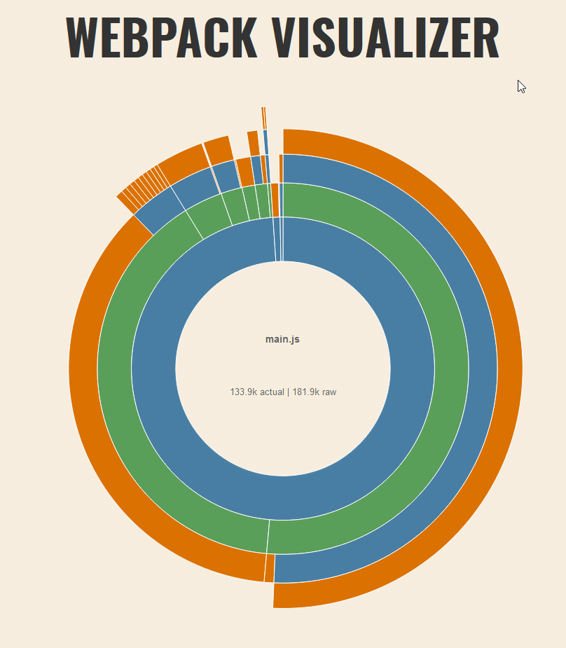
export default hot(module)(App);And what does the great visualizer tell us now? (hover text is difficult to read, you can click the image for a bigger size)
Well! Look who showed up to the party. It seems loading that icon has added 24.02 KB to our bundle (9.62 KB Gzipped). But what’s with the ”+ 15 modules (concatenated)?
I haven’t figured it out (ಥ _ ಥ). It isn’t the other icons in the package because there are a lot more than 15. And as you’ll see in a moment, when we pull in more icons we get a different message. Let’s move past that for now and see what else we can deduce.
Oh, and I also tried this alternate import style to see if it would possibly affect the size at all. The result was the same as the destructured version.
import Email from "emotion-icons/material/Email";

const App = () => (
  <div>
    <Email />
  </div>
);
Multiple Named Imports
Let us see what happens when we import say… 10 icons.
import {
  Email,
  Alarm,
  Android,
  AllOut,
  AcUnit,
  Adjust,
  AddCircle,
  AccountBox,
  AccessTime,
  AccessAlarm,
} from "emotion-icons/material";

const App = () => (
  <div>
    <Email />
    <Alarm />
    <Android />
    <AllOut />
    <AcUnit />
    <Adjust />
    <AddCircle />
    <AccountBox />
    <AccessTime />
    <AccessAlarm />
  </div>
);
I just chose the first icons that came up in autocomplete. By the way, you can check out the whole list with this handy little docz site. We should see a bigger bundle size, right? If not, we can assume that if even one icon is imported, the whole package is imported.
Well that is pretty cool. Each of the icons show up in our visualizer, and we can see that emotion-icons is now 29.46 KB (10.73 KB Gzipped), rather than the 24.02 KB we saw earlier with just one icon imported. Let’s see what that looks like in Webpack Visualizer.
You can see the blue “material” slice is comprised of 10 little orange icon slices. The green “emotion-icons” slice is pretty large in comparison, so this probably isn’t a package you’d want to use for just a couple icons.
Now I wanted to be extra sure that Webpack wouldn’t bundle a bunch of unused icons I’m importing, so I removed all of the uses of the components and just imported them.
import {
  Email,
  Alarm,
  Android,
  AllOut,
  AcUnit,
  Adjust,
  AddCircle,
  AccountBox,
  AccessTime,
  AccessAlarm,
} from "emotion-icons/material";

const App = () => <div>All icons shall waste away with disuse:(.</div>;
Which results in:

Back to the original bundle size with no icons being imported at all. Now that that sanity check is taken care of, let’s get crazy.
Load all the icons
I had to get a little creative here, but this is how I loaded every icon in the package:
import * as Material from "emotion-icons/material";

const App = () => (
  <div>
    {Object.keys(Material).map((icon) => {
      const MaterialIcon = Material[icon];
      return <MaterialIcon />;
    })}
  </div>
);
This took a really long time in the browser and I even got some Webpack warnings (which is pretty cool of them to even link you to a code splitting article).
WARNING in asset size limit: The following asset(s) exceed the recommended size
limit (244 KiB). This can impact web performance.
Assets:
  main.js (832 KiB)
  0.12368426384d517b301f.hot-update.js (581 KiB)

WARNING in entrypoint size limit: The following entrypoint(s) combined asset
size exceeds the recommended limit (244 KiB). This can impact web performance.
Entrypoints:
  main (1.38 MiB)
      main.js
      0.12368426384d517b301f.hot-update.js


WARNING in webpack performance recommendations:
You can limit the size of your bundles by using import() or require.ensure to
lazy load some parts of your application.
For more info visit https://webpack.js.org/guides/code-splitting/
But it did work! and here is the visualized bundle.
Wow! 580.68 KB in just the emotion-icons package now. I, of course, removed the .map to see if the import * as Material would still be ignored in the final bundle, and it was. An interesting side note, though. If you even console.log the import, it will add the whole package to the bundle, like you see in the previous screenshot.
Conclusions
It’s really cool to see modern tooling working in such an efficient way. I take it for granted most days, but doing little exercises like this really make me appreciate all the great work the open source community has contributed to better DX and UX. I still have some further testing to do, but this is where I’ll wrap up this post. I hope anyone who is crazy enough to read the whole article will be inspired to do some testing of their own to make their current/future sites a snappier experience.